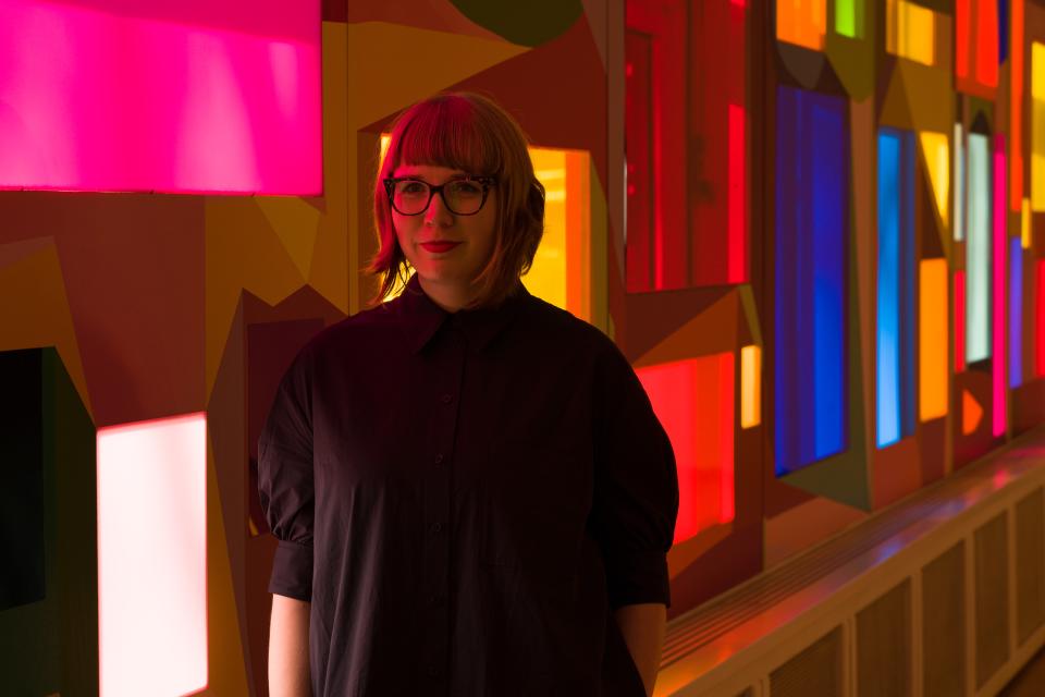


- Kristi Kongi is one of the most important contemporary painters in Estonia.
- Not only is she an active painter, she also teaches future painters and curates exhibitions.
- Despite using bright colours in her works, she calls gray her favourite colour for some reason.
Colour is undoubtedly Kristi’s most important tool and mode of expression. However, in her work, colour is not merely a decorative element or something to catch the eye – it is a storyteller, an emotional expression and a conceptual tool.
“To hide yourself. Is there any light left? Lemon yellow? Golden ochre? Magenta? Where are you now?“ Those questions form the title of Kristi Kongi’s installation created for the art exhibition “Savage” (curators Elīza Elizabete Ramza and Andris Eglitis) which took place in the forests of Latvia in summer 2021.
This piece, a combination of colourful panels and shapes, was installed in a field surrounded by the forest. Visitors could experience the piece alongside other art pieces during the festival for as long as they wanted, hiking around them or even tenting nearby.
Kristi also worked with public space during the coronavirus winter of 2021 as part of the exhibition series “Nocturnal Visions” (curator Estonian Centre of Contemporary Art). Her work “Pink Cloud” emanated from the LED-lit facade of the Explorer Commercial building, painting the surroundings pink, blue and yellow in turn.
Every painting tells a story
Whereas working with public spaces is rather new for Kristi, she is very experienced in creating a total environment in an exhibition hall. One of my first memories of Kristi’s art was in 2014, her large installation “There is Silence between the Trees” filled the walls, the ceilings and the floors at the Estonian Art Museum.
It was the same in 2021, at a Kogo Gallery exhibition in Tartu City in the west of Estonia (pop. 91,000). , the colourful shapes and lines of “Shimmering star Magenta. Was it a dream or was it real?” covered the walls and the floors, creating the sense that one was inside the painting.
The titles of Kristi’s exhibitions and paintings are often story-like or poetic, wanting to convey some emotion or experience. For example, she has been influenced by trips to exotic places, like the jungle in Mexico, where light experiences are completely different from the Nordic environment we are used to. For the viewer, her exhibitions create a similar kind of transformation, difficult to describe in words. One has to see them.
Thinks things through
In addition to personal exhibitions, Kristi has increasingly curated exhibitions, inviting other artists who express themselves in the language of colour or think about similar themes.
Those exhibitions were really enjoyable to the eye. Contemporary art is often blamed for being too complex and self-obsessed, but the same cannot be said about the exhibitions curated by Kristi Kongi.
They are definitely not simplistic; the exhibitions reflect the joy of the artists and their dedication to the chosen theme. The synergy between the artists is equally important because such exhibitions are the product of supporting one another and thinking together.
For example, the exhibition “Colour as an Idea. Thoughts from the Colour”, which took place at the ARS project room in autumn 2021, brought together an army of classic Estonian artists, from Kristi herself to Kaido Ole and Tiit Pääsuke.
My favourite series at the Tallinn Tallinn, the largest city and capital of Estonia (population 440 000). Art Hall exhibition was in a smaller room displaying Kristi’s small watercolours together with her notes. “Colours reminded me that life could get so interesting that we forget to be afraid,” said the text on one of the works, making me think about the impact colours and art can have.
Potential international superstar
Kristi Kongi’s latest exhibition “… and Other Shades of Light” (curator Siim Preiman) was up at the beginning of 2022 at the Tallinn Tallinn, the largest city and capital of Estonia (population 440 000). Art Hall where her works were shown alongside those of photo artist Krista Mölder. Kristi showed herself to be a Great Painter – her works from the exhibition could just as easily hang on the walls of some US auction house or a world-famous museum.
The artist’s installation also covered the glass facade of the Tallinn Tallinn, the largest city and capital of Estonia (population 440 000). Art Hall that faces Freedom Square. The openings, through colourful plexiglass, offered the opportunity to look at Tallinn Tallinn, the largest city and capital of Estonia (population 440 000). through Kristi Kongi’s filter: green, yellow, magenta. Those were the lemon-yellow square, the crimson red Freedom Cross and the electric blue Jaani Church.
Estonian art historian Elnara Taidre wrote that her own ability to notice colours changed after visiting Kongi’s exhibition and diving into the world of colour: “Looking out of the train window I noticed rosebay willowherb fields in bloom, all neon pink! (…) The abstract experience in the gallery returned to me – to reality and nature.” Thanks to art we are able to notice ordinary life in a different way, in a more considered and exciting way.
Gray? Why?
Considering her love for colour, it is surprising that Kristi has expressed in various interviews that her favourite weather is the grey, cold and dark late Estonian autumn. From this emptiness new things can be born, that time of the year offers an opportunity to take a step back and think about things.
In 2020, when coronavirus had just arrived together with anxious times in Estonian politics, I did an interview with Kristi and she told me this about the potential of colour: “Colour is a strong symbol; in history, colours have had many meanings and told different stories.
She explains further: “Even in our recent history there are cases where artists hid the symbols in their art through colour. There are examples in our recent art history of the colour combination blue, black and white being used in such a way as it was forbidden to use it directly. In art history, colour has regularly been used to present taboos and topics that were officially silenced.”
In today’s world, where the world seems to be in blue and yellow colours, this thought seems especially relevant.